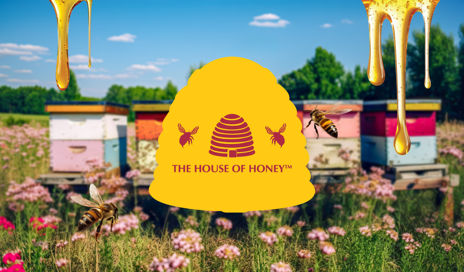
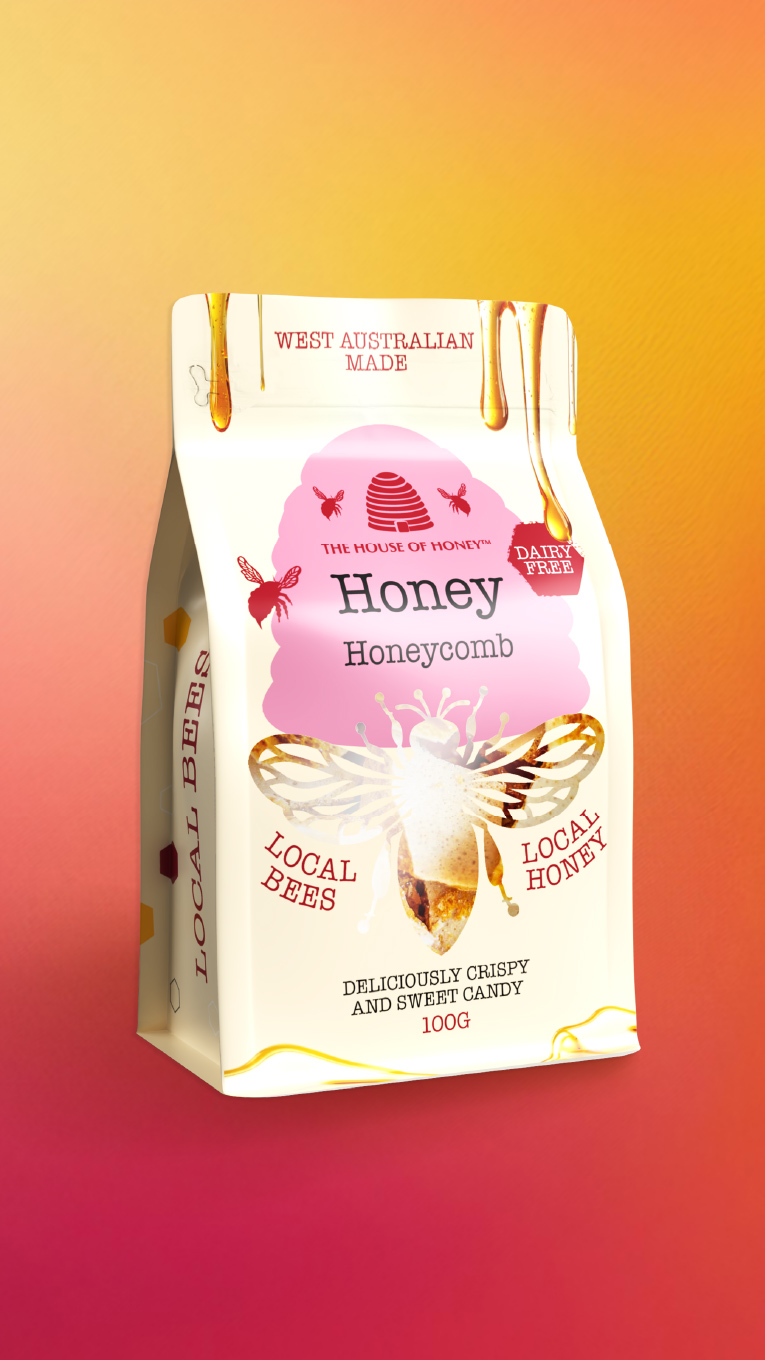
The House of Honey is a beloved Western Australian brand, known for its range of premium-quality honey products. Not only is it a favourite among both tourists and local customers in WA, but it has also begun exporting internationally, gaining recognition beyond Australia. With this growing presence, it was the right time for a refresh—one that would modernise the look, restore unity, and strengthen shelf impact without losing the warmth and heritage customers love.
The Challenge
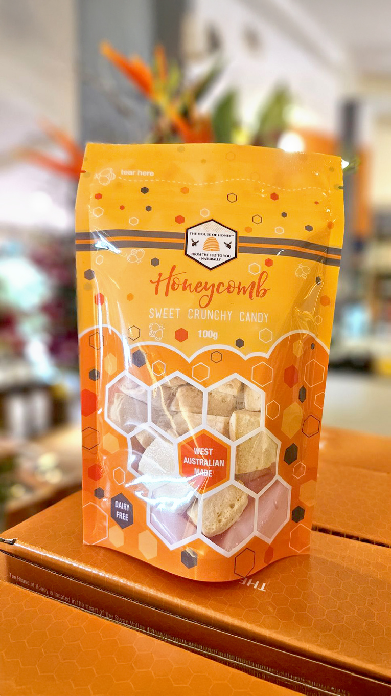
However, as the product line expanded, the visual identity became fragmented. For instance, different product shapes and usage occasions resulted in inconsistent packaging across the range. Additionally, design elements like logo placement, font styles, and colours varied, leading to confusion and diluted brand recognition.
Moreover, customers also struggled to distinguish between premium and more economical lines. Therefore, any update needed to feel like a natural evolution, not a dramatic departure. It was important to protect the emotional connection with long-time customers and stakeholders.
Our Solution
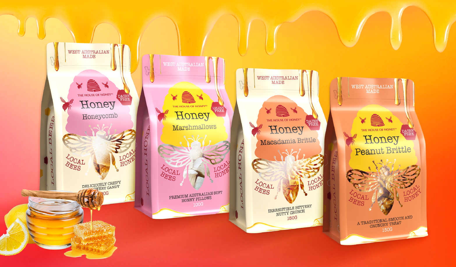
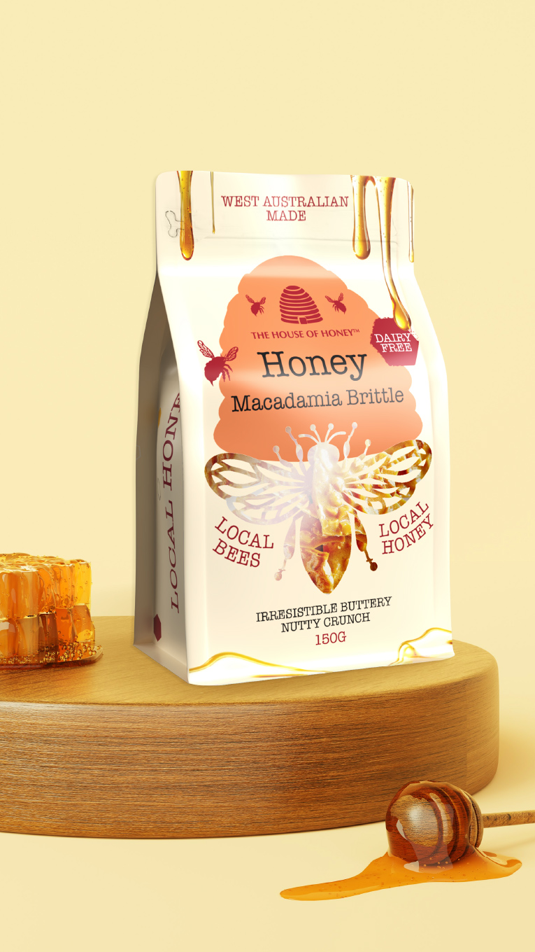
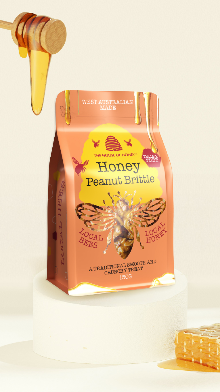
To address these challenges, we developed a clear, cohesive visual system. By doing so, this approach brought unity across the range while celebrating the brand’s roots.
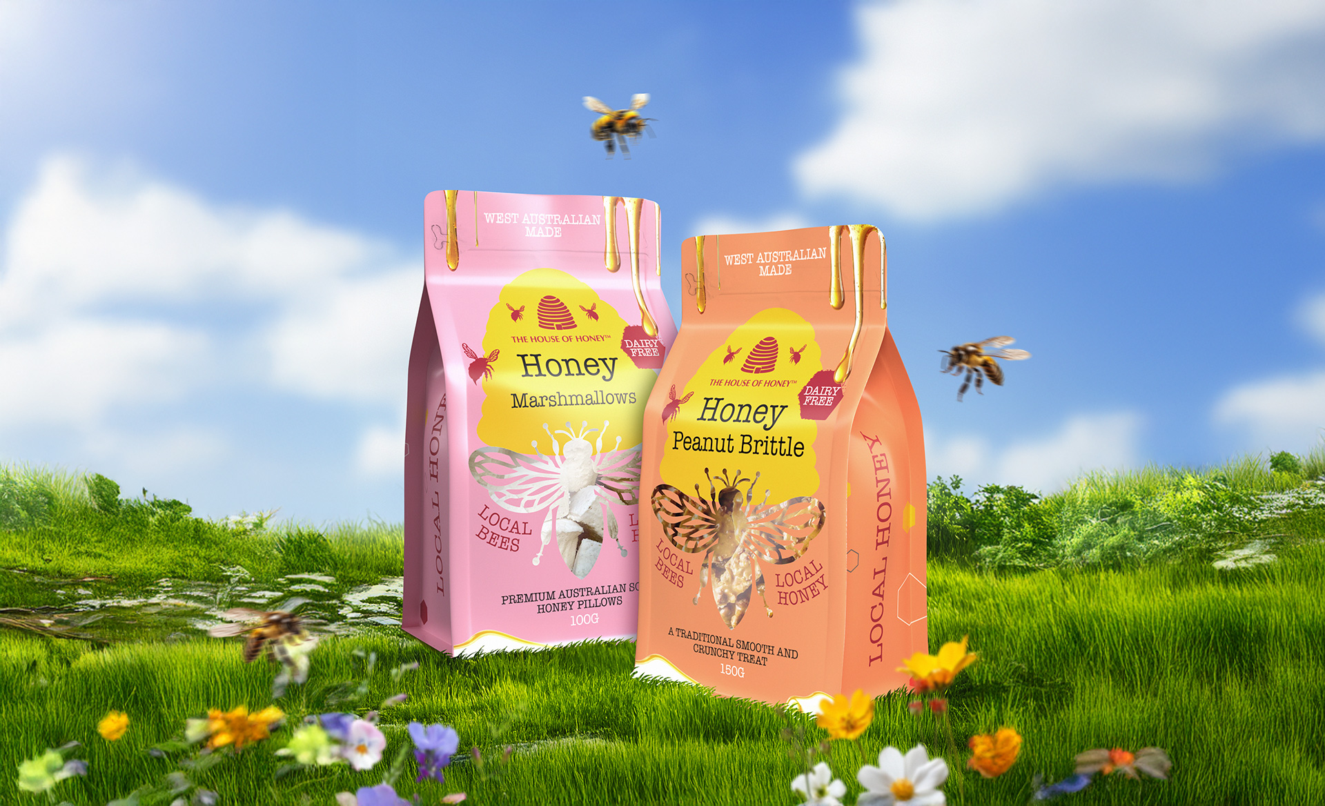
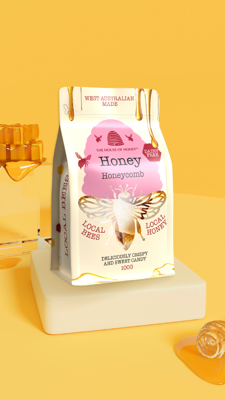
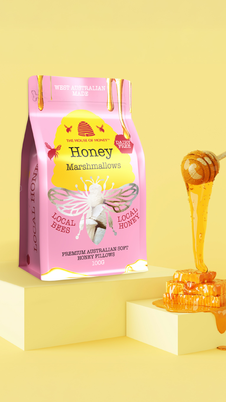
A key solution was a custom bee-shaped window. Not only was this a playful brand icon, but it also functioned as a window, showcasing the honey inside. Furthermore, to add appetite appeal, we included realistic honey drips at the top and bottom of the pouch, reinforcing the indulgent, natural quality of the product.
As a result, this new system unified packaging across all products and created a strong, flexible framework for different formats, from wine to confectionery to honey SKUs. In fact, what began as a single pouch redesign soon became the inspiration for the brand’s entire portfolio.
The Impact
The refreshed packaging quickly became a centrepiece for the brand. It inspired the owner to update the entire range. The new visual system is easy to apply across different product types. This ensures consistency while keeping the brand’s charm and flexibility.
Customer response has been very positive, especially among tourists in Asian markets. Many are drawn to the design’s balance of premium appeal and authentic storytelling.
By preserving the brand’s essence and modernising key details, we created a visual system that stands out. It not only looks beautiful but also performs well across every touchpoint.