Livity Cold‑Pressed Juice Label Design: A Visual System Across Every Bottle
Overview
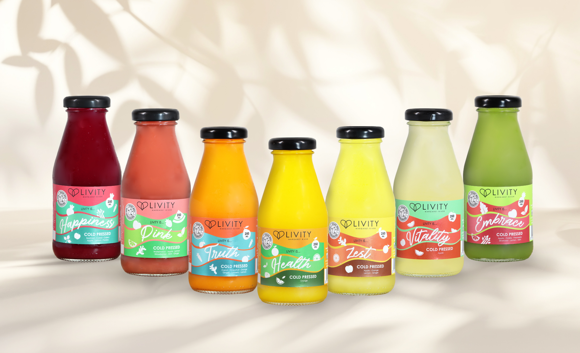
Livity is a cold-pressed juice and wellness brand based in Margaret River, Western Australia. Notably, the brand is known for clean nutrition and local ingredients. Its range includes fresh juices, immunity shots, and detox cleanses. Although the products performed well, the visual identity lacked energy and shelf presence.
The original label design was clean and minimal. However, in a colourful and fast-moving health drinks category, it easily got lost. As a result, Livity wanted to add vibrancy to the brand and create a unified look for their expanding range. Therefore, they needed a flexible design system that could grow with them.
The Challenge
The brand needed a flexible system that brought excitement, consistency, and shelf standout. However, the old label system was too simple and didn’t reflect the brand’s energy or premium quality. For example, Cold Pressed Juice, Cleanse Packs, and Immunity Shots all had different sizes and shapes, yet no unified look. Moreover, new products were launching often, and the existing layout didn’t scale with ease.
The Solution
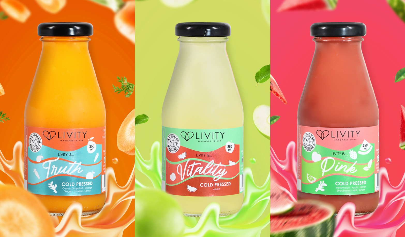
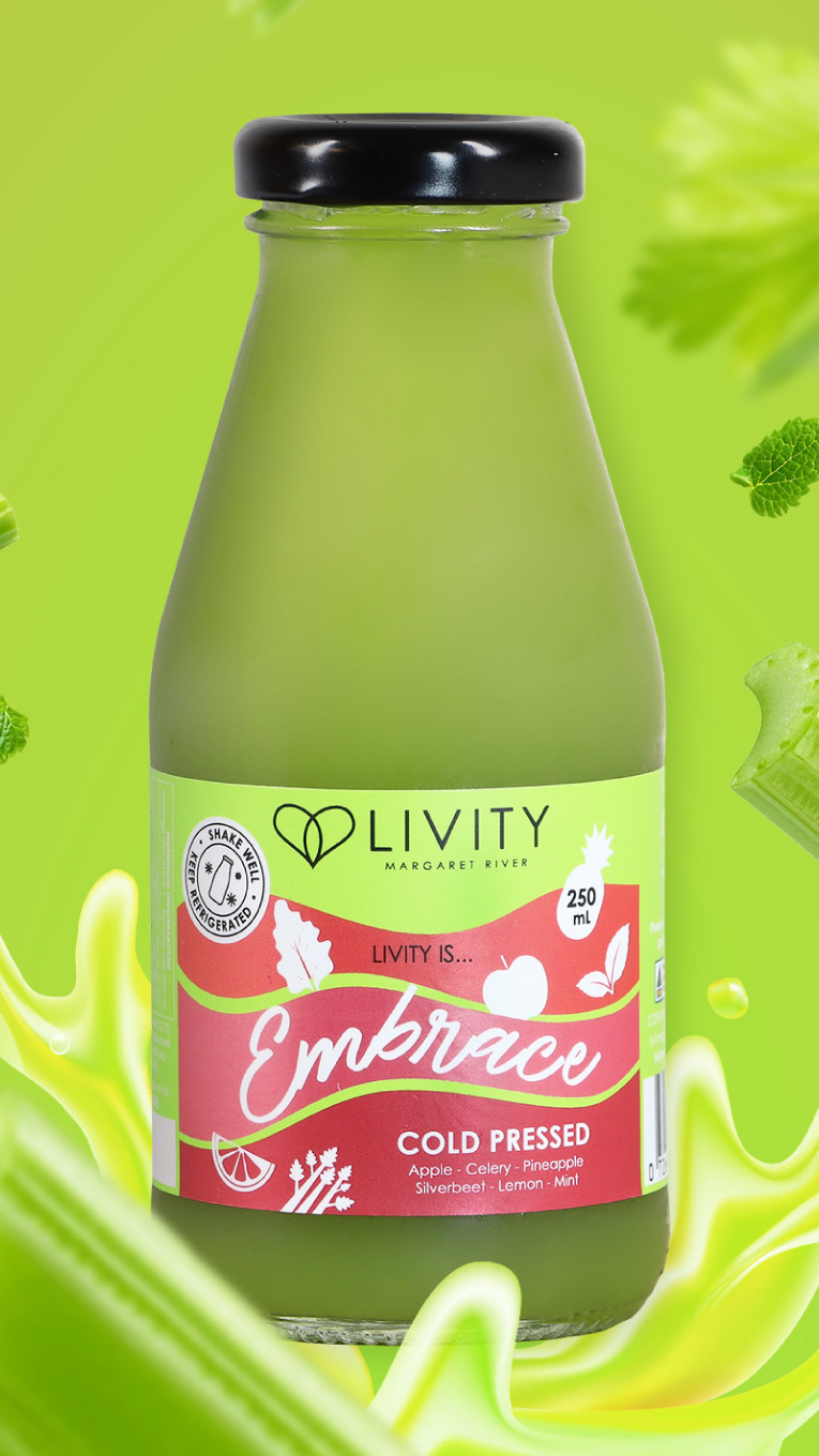
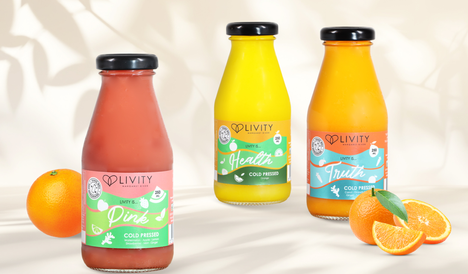
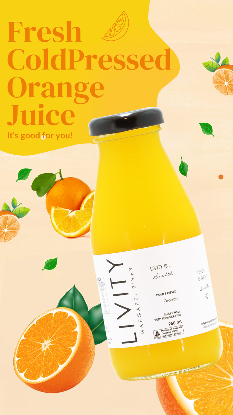
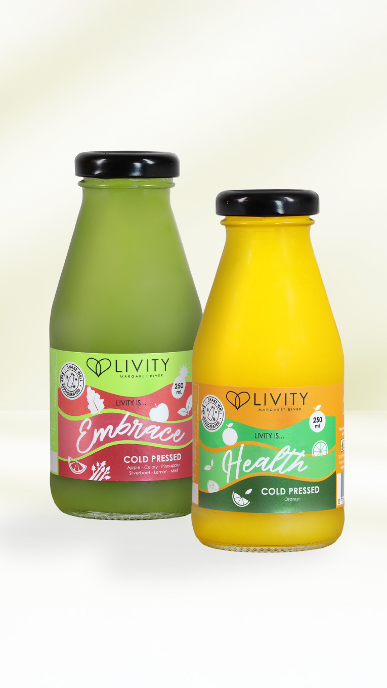
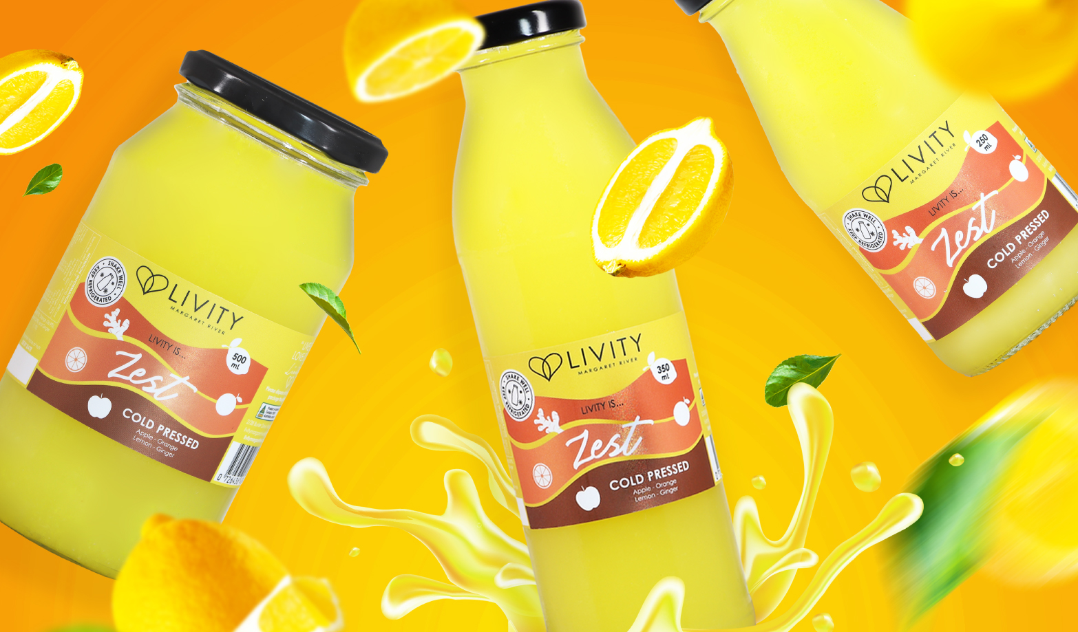
Brand-led Visual Movement: Inspired by the brand name itself, we developed a dynamic wave graphic that mimics the flow of juice. As a result, this brings movement and vitality to every bottle.
Colour as a Hero: Each SKU received its own bold colour palette. Consequently, customers can differentiate flavours quickly, while the packaging creates strong shelf impact.
Flexible System: The label system was designed to scale across all bottle sizes and future product launches, from 250ml juices to small-format wellness shots. This approach ensures consistency and flexibility as the range grows.
Material & Adhesive Advice: We selected a material with the right adhesive to hug the curved bottles without bubbling. Therefore, the labels are easy to apply by hand or machine, ensuring a smooth, premium finish every time.
The Impact
The brand now looks as fresh and lively as the juice inside. The new design gives Livity real shelf presence while staying true to its clean, local, and health-first values. It’s vibrant, recognisable, and ready to grow with the brand — one bottle at a time.
It’s now LIVITY — lively, fun, and premium all at once.