Thirsty Fox Picks: Top 5 Coffee Packaging Design Trends for Brands
If you’re a coffee roaster, café owner or exporters looking to refresh your packaging, launch a new product line, or move away from generic bags to custom-printed pouches, design is your most powerful tool.
Forget flavour notes and altitude chatter for a moment. In 2025 the pack is the product, the right design can boost sales, streamline operations, and even turn casual buyers into loyal fans.
We’ve helped brands craft packaging that stands out and sells. Based on what’s working in 2025, here are five design directions winning attention (and customers) for coffee businesses like yours. See which one aligns with your brand—or use this as inspiration to refine your packaging strategy.
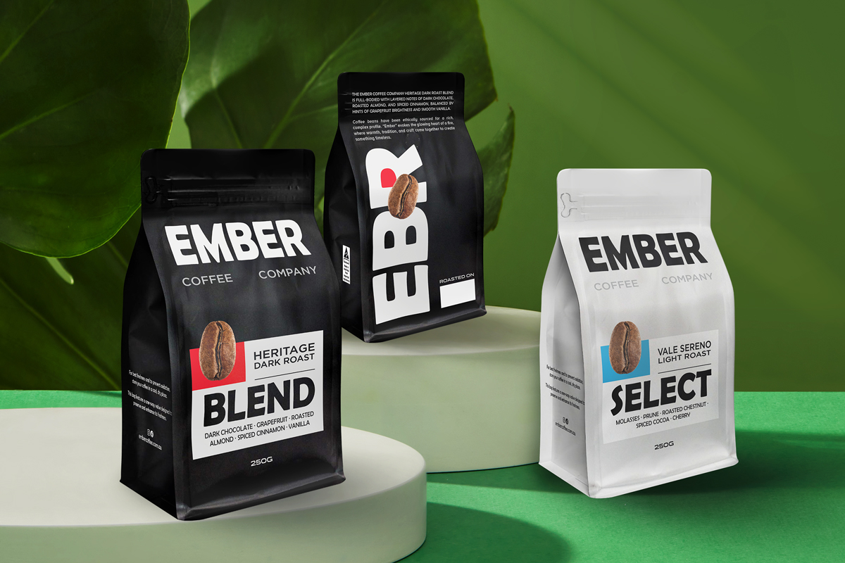
1. Minimalism with a Pin-Stripe of Colour
Picture a pouch that is almost entirely black ,or pure white, broken only by an oversized sans-serif title and a razor-thin bar of colour that signals the SKU. This stripped-back language does three powerful things for your shelf:
Creates instant contrast. When every bag around you is shouting with artwork, an expanse of negative space draws the eye faster than any illustration. Side-by-side on a retail wall, alternating light and dark packs form a high-impact “block” that doubles as décor and photographs cleanly for social.
Protects operational agility. Limiting the artwork to one core plate (text) plus a single spot-colour overlay means lower minimum order quantities, quicker press-changeovers and easier colour management when you scale or localise SKUs.
Maintains digital legibility. Bold type and generous white space stay recognisable when your pack shrinks to a mobile thumbnail, so the same design carries seamlessly from physical shelf to e-commerce carousel.
Design discipline is critical. Once you stray beyond a half-dozen accent colours, the visual system loses its punch and drifts back into noise. Keep the palette tight, let typography do the heavy lifting, and your packaging will deliver a premium cue without inflating production costs.
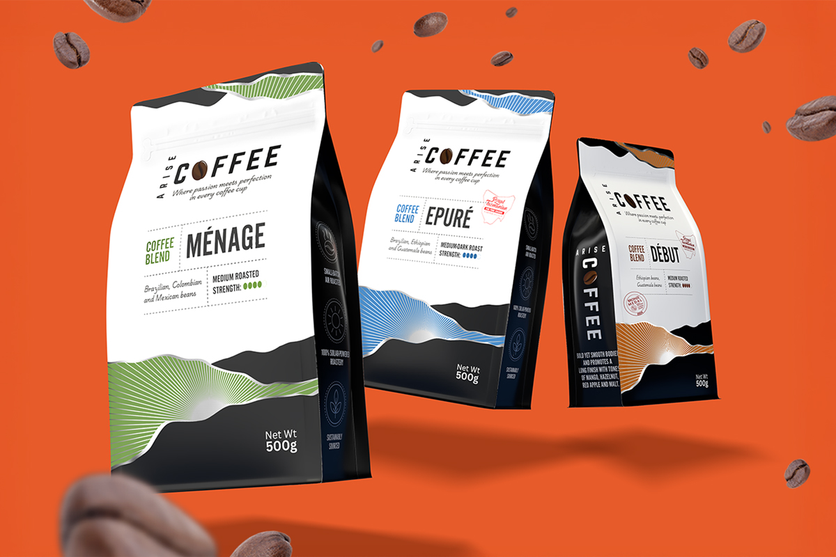
2. Design That Amplifies the Brand Concept
For brands with a great story or name — but no visual system to express it.
Too often, brands have a powerful idea baked into their name or mission, but the packaging doesn’t show it. A bold concept stuck inside a generic pouch gets lost on the shelf — and in customers’ minds. This design approach is about transforming your brand story into a distinct, ownable visual language.
Here’s how to make the concept come alive:
Turn abstract ideas into visual metaphors.
For Arise Coffee, the name suggests energy, momentum, and new beginnings. In our redesign, we brought that to life by integrating sunrise-inspired graphics into each pack — waves of colour that rise across the front panel. Suddenly, the brand feels like its name.
Build visual consistency across every SKU.
Each variant features a different sunrise tone (green, blue, gold), but the graphic system stays intact. That consistency creates strong shelf presence, while colour differentiation aids navigation.
Create a flexible identity that works beyond the pack.
When the design system reflects the brand idea, it becomes instantly adaptable — for websites, social media, merch, and point-of-sale displays. The sunrise wave from Arise now appears on landing pages and campaign banners, reinforcing the concept at every touchpoint.
Make your story feel visible and ownable.
This isn’t about writing a paragraph of copy on the back — it’s about making customers feel the story in one glance. Ownable visual elements (like Arise’s sunrise curve) become assets that no other brand can use.
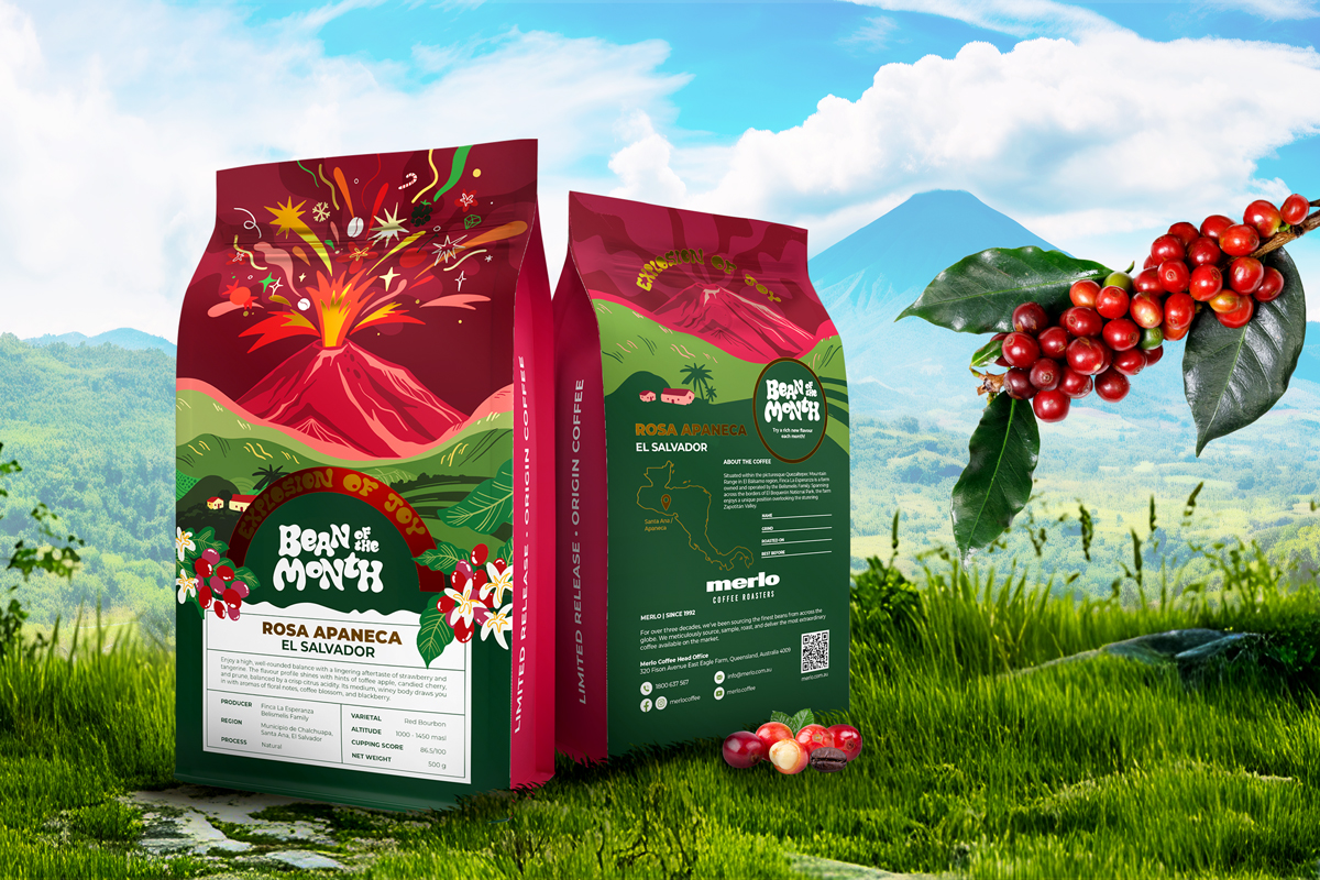
3. Origin-First Storytelling
Specialty Coffee Or Fine Robusta drinker wants proof, not poetry, so leading with hard data has become a design strategy in its own right. Latitude-and-longitude, harvest month, elevation and process now occupy the hero zone where a logo used to sit.
Here’s how to design for that:
Make your product feel real.
Don’t just say “Kenya AA” — show it. Line illustrations of the grower’s hands, village silhouettes, or region-specific textures (like Ethiopian tribal patterns or Vietnamese highland scenery) bring location to life visually and emotionally.
Differentiate with texture and soul.
Origin-driven packs often lean into earthy tones, layered illustrations, and tactile finishes. It’s a great contrast to generic minimalist designs, adding depth and warmth to your visual language.
Design for in-store fluency.
Use consistent iconography or coordinates on the front label that baristas can reference when recommending brew methods or origins. The more confidently they can speak to what’s in the bag, the more trust your pack earns.
Build in wholesale transparency.
Use scannable QR codes that link to grower stories, harvest videos or certifications. It’s not just a value-add — it’s a procurement asset, helping you tick sustainability and traceability boxes for retail partners.
Design for change.
If your origins rotate seasonally, build a fixed visual shell (e.g., brand block, illustrated backdrop, pouch colour) and treat the origin data as a dynamic layer. Use digital printing or removable labels so you can update details without redesigning the whole pack — saving time, cost, and waste.
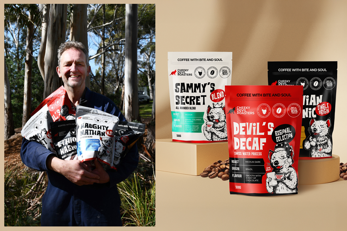
4. “Mirror-Me” Graphics
For brands that want their packaging to reflect the customer — or represent something bigger than the beans.
Coffee packaging doesn’t just need to look good — it needs to mean something. Whether that’s expressing the personality of the buyer or the deeper purpose behind the brand, expressive visual language can build connection, loyalty, and pride of ownership.
Here’s how to design packaging that resonates:
Reflect your customer — or your cause.
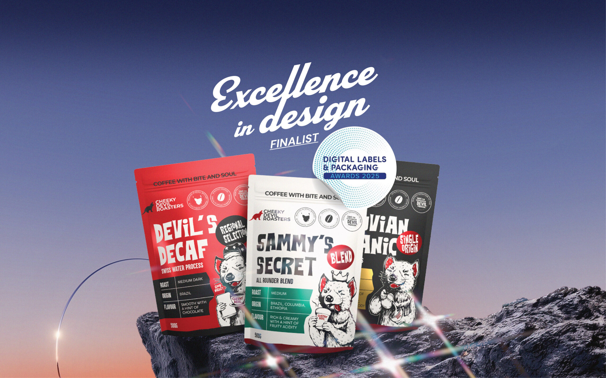
Some packs mirror the buyer’s taste or humour. Others reflect a mission. Take Cheeky Devils Roasters: based in Tasmania, they use every sale to help save the endangered Tasmanian devil. Their design isn’t just bold and cheeky — it means something. The visual identity tells you who they are and what they stand for, instantly.
Use colour and character intentionally.
Expressive design isn’t about being loud for the sake of it. Use confident colour, bold type, or mascot-style graphics to reflect the tone of your brand — playful, rebellious, sophisticated, or cause-driven. Just make sure it ladders up to something true.
Inject tone of voice to match.
Don’t let your visuals carry the story alone. A clever name, a line of copy, or a roast description with personality brings the pack to life. Whether it’s cheeky, heartfelt, or deadpan dry, tone builds relatability — and shareability.
Design for real-world pride.
The best packs earn a place on the counter, not just in the cupboard. Design for the ‘shelfie’ moment — clear icons, bold layout, premium finishes. When customers feel good about your pack, they’ll show it off (and talk about it).
Anchor the chaos.
When you’re designing with attitude or expressive graphics, guardrails matter. Use consistent visual codes — colour rules, logo placement, signature illustration styles — to keep the design system cohesive across SKUs and channels.
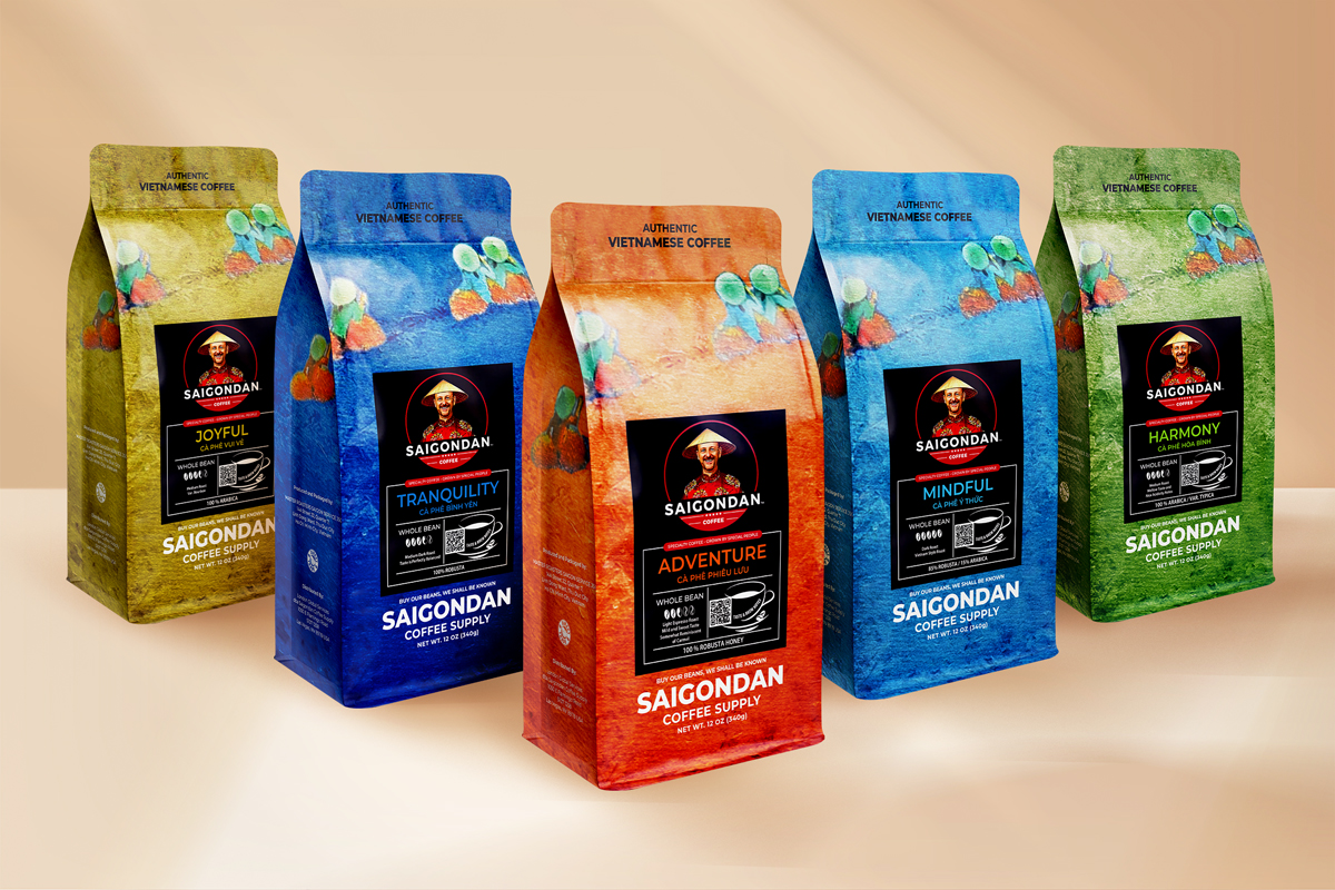
5. Founder-Flavoured Personalisation
For brands where the founder isn’t just behind the scenes — they are the brand.
More coffee brands are putting their story, personality, or quirks front and centre — not in a self-indulgent way, but in a way that makes the packaging unmistakably theirs. It’s not about ego. It’s about making something no one else could own.
Here’s how to bring personalisation into your design:
Turn quirks into cues.
Your backstory, hobby or obsession might be the very thing that makes your packaging memorable. Maybe it’s a dog you named the roast after, your cycling route through the plantations, or a doodle from your notebook that became a label graphic. Own it visually.
Design a signature asset.
Whether it’s a character based on you, a stylised portrait, or your handwritten note on every pouch — create something unique and reusable across SKUs. It becomes your “face” on shelf and adds cohesion without relying on templates.
Layer the story in, don’t dump it.
Avoid paragraphs of biography on the front. Use smart layout and modular storytelling — e.g., a short roast note, a quote, or a QR code that expands the narrative online. Let the design invite curiosity rather than overwhelm with detail.
Make the pack feel made by someone, not something.
Little touches like personal language, imperfections, or tone of voice help humanise the brand. Think: “Roasted for your Monday morning panic” instead of “Premium blend.” These details cost nothing to print but deliver massive brand warmth.
Protect scalability.
As your business grows, you may not want your face on every SKU. Build a design system that can evolve — keep the tone, the humour, or the illustrated signature asset, but allow flexibility to expand without losing authenticity.
Brewing the Benefits
Across all five trends, the common thread is clarity. Minimalism catches the eye, origin design builds trust, data-led layouts answer questions before they’re asked, expressive graphics spark emotional alignment, and founder-first packs make it personal.
Each trend also pulls commercial weight — whether it’s reducing print costs, boosting social shares, commanding a higher price point or unlocking wholesale doors.
So here’s your playbook:
Pick one visual language aligned to your biggest business goal — premium pricing, retail standout or brand buzz.
Test fast with a digital print run in-store or through a trusted café partner.
Track what moves the needle — from sell-through speed to QR scans or social saves — and iterate quickly.
In a market where coffee is just one scroll away, your packaging has to work harder than ever. Build a pack that sells your origin, your values and your customer’s identity in one glance — or risk being just another bag on the shelf.
Ready to Brew a Better Pack?
If your current packaging isn’t telling your story, proving your value, or getting picked off the shelf — it’s time to rethink it.
At Thirsty Fox, we’ve worked with coffee roasters across Asia Pacific to turn generic pouches into brand assets that drive loyalty, shelf standout, and sales. Whether you’re scaling up or levelling up, we know this space and how to design for it. Contact us!