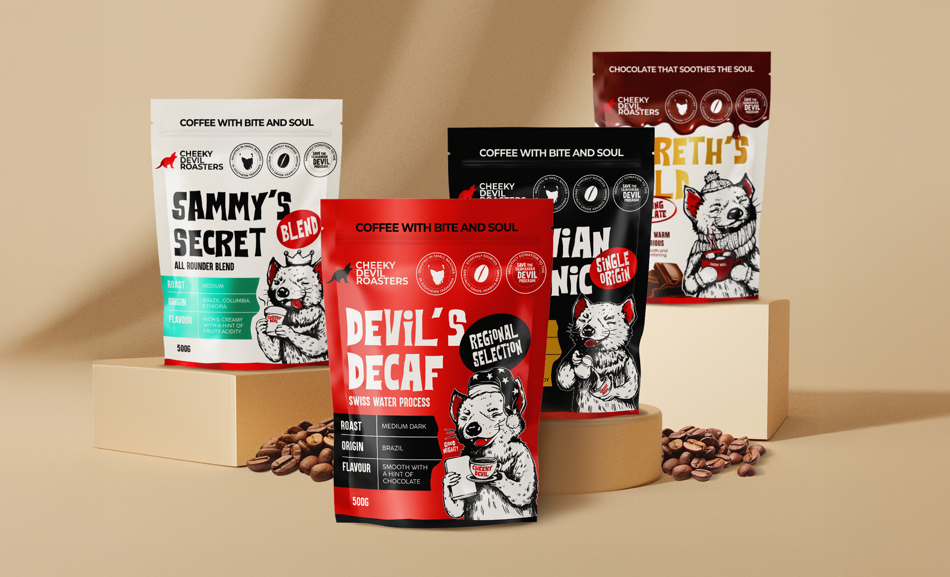
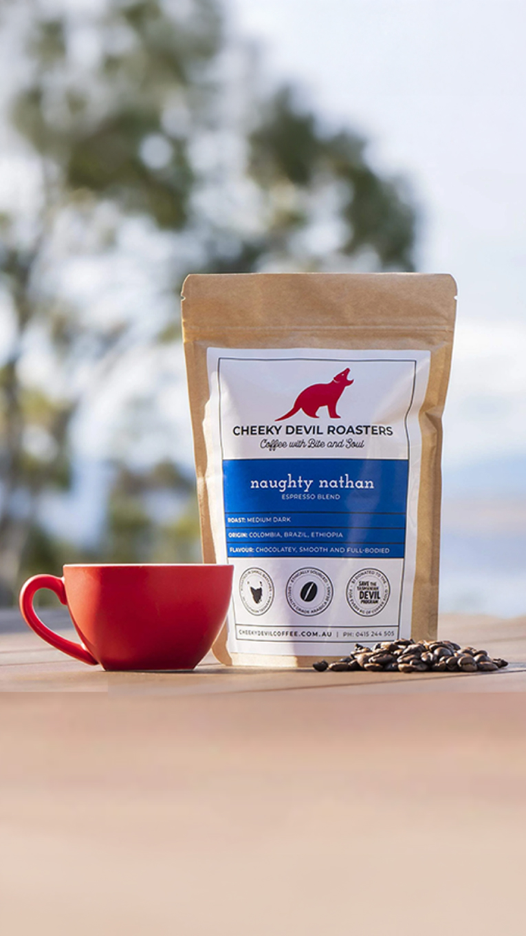
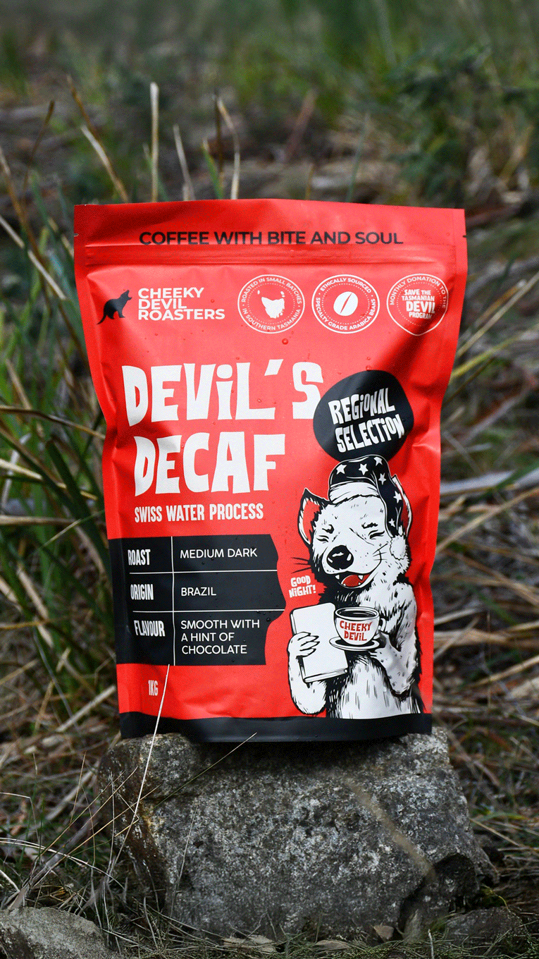
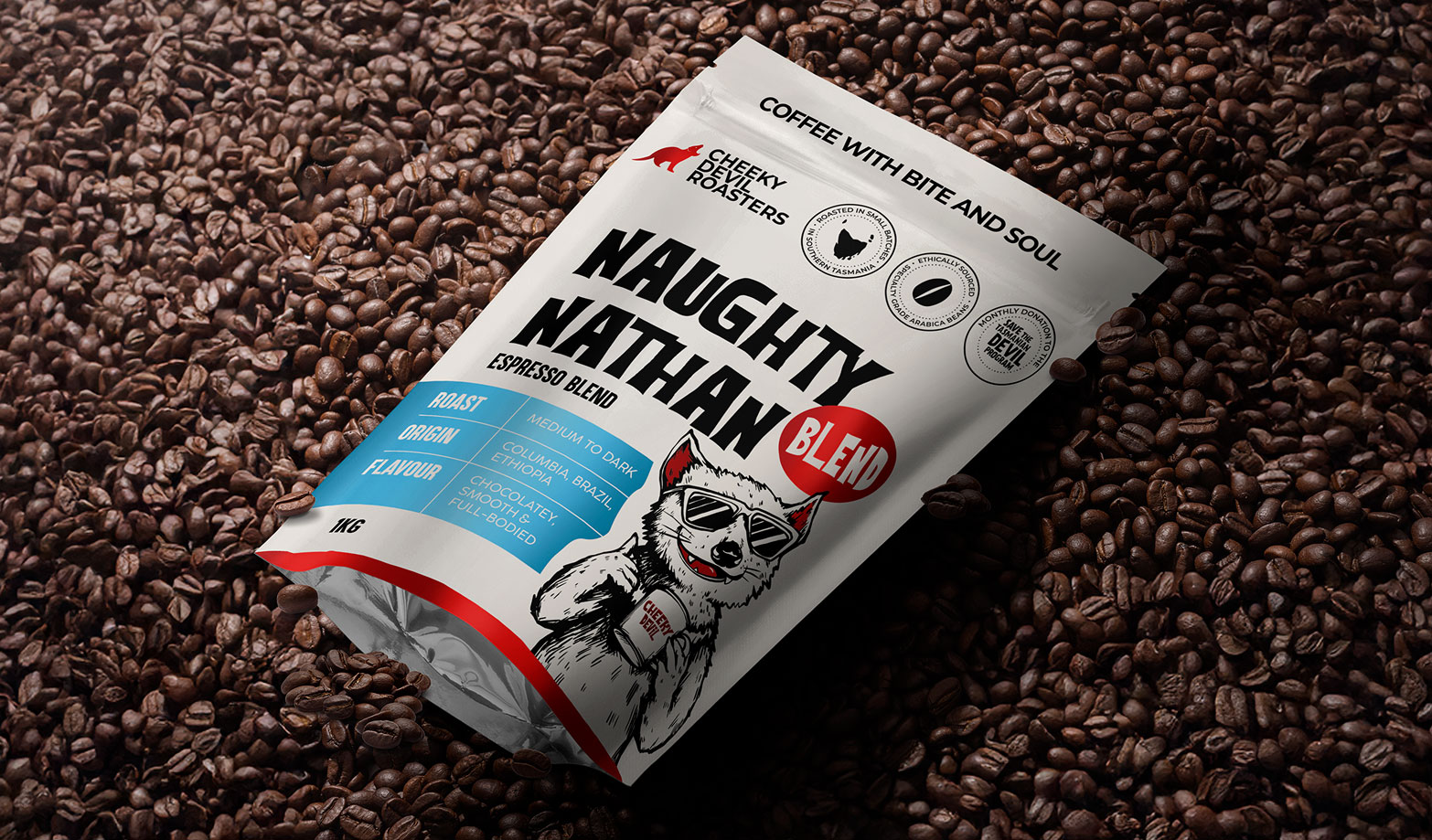
Meet Clive and Robyn—the passionate duo behind Cheeky Devil Roasters. What started as a small coffee roasting operation soon became a heartfelt expression of family values. Each coffee blend carries the name of one of their children “Secret Sammy”, “Naughty Nathan”, creating an intimate connection between their product and the joy of everyday family life. But as the business grew, so did the need for packaging that matched their story, energy, and cheeky personality.
The Challenge
Despite the premium quality of their beans, the original packaging fell flat. It lacked shelf appeal. It didn’t connect. And it failed to communicate the brand’s distinctively playful spirit. Key pain points included:
A disconnect between packaging and product quality
A missed opportunity to engage coffee lovers emotionally
A weak expression of the brand’s personality
Low visibility in a competitive retail landscape
The Solution
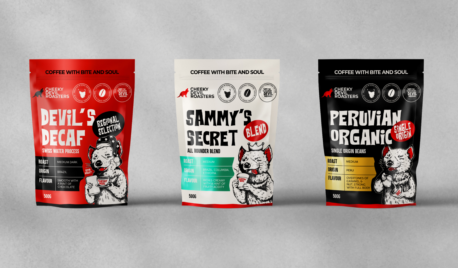
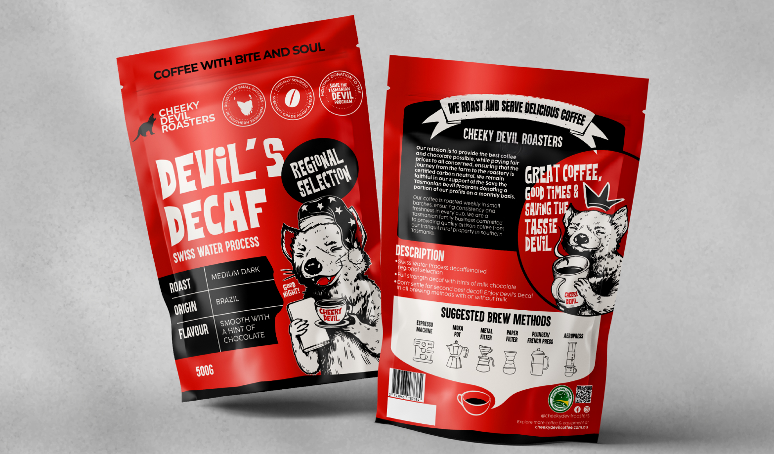
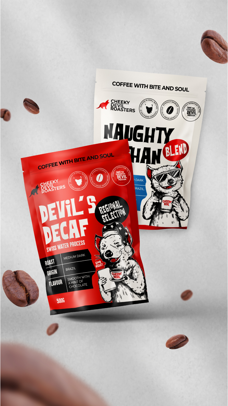
Partnering with Thirsty Fox, Clive and Robyn set out to turn their packaging into a powerful brand statement. The cheeky devil mascot was reimagined as a bold brand ambassador – playful, memorable, and full of personality. Digitally printed with striking metallic finishes and vibrant colour blocking, the new packaging leaps off the shelf and reflects the premium, family-owned story within.
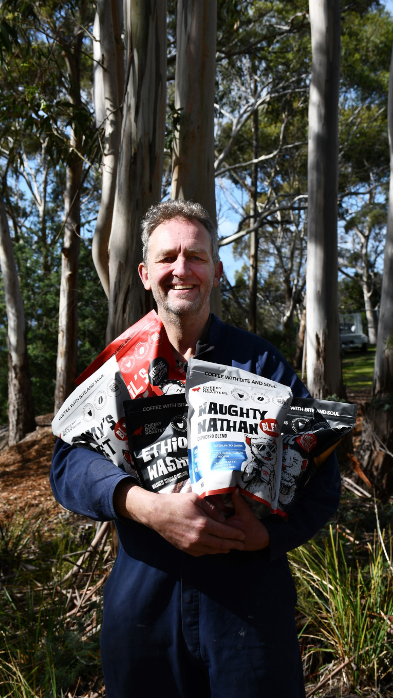
The Impact
The redesigned packs don’t just look good – they work hard. They’ve created an emotional bridge between product and customer, driven loyalty, and sparked genuine brand love. Clive puts it best:
“I know we are all going to love the pouch. Today I signed an agreement to do radio advertising. The creative director of the radio station said the branding (packaging) was amazing and hit all the major considerations from a marketing perspective.”